
High profit expectations: is the next crash looming?
The following chart shows the performance of the broad U.S. S&P 500. The historical time series goes from 1992 to the last quarterly reporting season. Subsequent data (from Q3 2022 to Q2 2024) are analysts’ expectations for future company profit performance as compiled by Bloomberg. The chart also shows the linear trend line for historical profit performance – up until the outbreak of the COVID-19 pandemic.
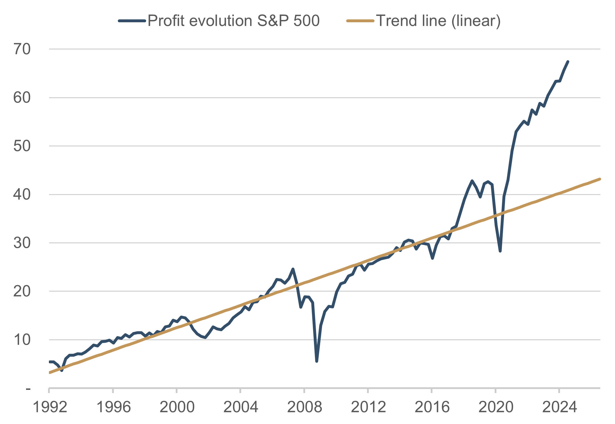
Graphic 1. Profit evolution S&P 500 vs. trend line (linear) | Source: Bloomberg Finance L.P.; date: 30 September 2022
The chart was presented in the above form by another market participant. The narrative this chart tells is clear: company profit performance has drifted far from the trend thanks to enormous fiscal and monetary support and the analyst consensus has automatically extrapolated this abnormal development into the future. The obvious conclusion is that analysts have to drastically correct their estimates downwards and therefore there is significant downside risks to share prices. This is quite a logical line of reasoning that also appears to be obvious from the chart. Now let’s look at the data series in Figure 2:
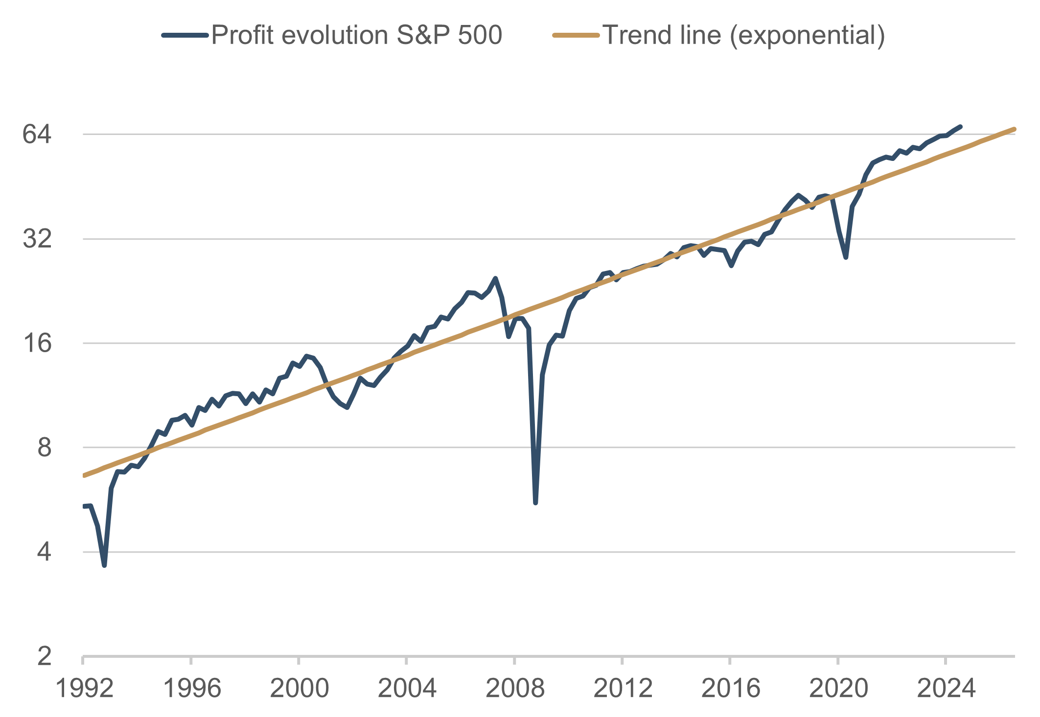
Graphic 2. Profit evolution S&P 500 vs. trend line (exponential) | Source: Bloomberg Finance L.P.; date: 30 September 2022
The trend is also shown on this chart. However, in this instance we see no significant deviation from the historical performance. Even though the data in the series in Figure 1 and Figure 2 are the exact same. The only difference is how they are presented. While a linear scale is used on the y-axis in Figure 1, a logarithmic scale was used in Figure 2. In other words, while in Figure 1 an absolute change of 10 points always takes up the same amount of space on the vertical axis (be it a change from 10 to 20 or from 60 to 70), Figure 2 shows the same percentage change on the vertical (so +100% can just as well be a +2 movement from 2 to 4 or +32 from 32 to 64). Unfortunately, in the world of finance we still often see the linear form of presentation in Figure 1, partly out of ignorance, partly due to lack of technical means, but also in some cases intentionally to intuitively steer the reader in a certain (wrong?) direction. The longer the time series presented, the more deceptive the representation of linear scales becomes. The reason for this is the compound interest effect, once described by Albert Einstein as the eighth wonder of the world, the long-term impact of which is almost always underestimated.
So, what is truth in the narrative of excessively high profit expectations? At least we can also take from Figure 2 that current analyst estimates do not portray any serious risk of recession. Instead, what we see for the next two years is the growth trend of around 6.9% per annum for S&P 500 company profits observed in the past 30 years – which is very common practice among analysts for making many forecasts in the financial markets, even though there is very little value in it. This makes current estimates very vulnerable to negative surprises, especially given that the profitability of many companies is well above average at the moment.
All things considered, analysts’ estimates of projected company profits should be taken with a pinch of salt. The crash scenario presented by Figure 1 is not a foregone conclusion, however, but is just one of many scenarios in a global economy that is generally riddled with uncertainty.

Please contact us at any time if you have questions or suggestions.
ETHENEA Independent Investors S.A.
16, rue Gabriel Lippmann · 5365 Munsbach
Phone +352 276 921-0 · Fax +352 276 921-1099
info@ethenea.com · ethenea.com